Branding · 2025
Client
Srđan Hair
Year
2025
Services
Brand Strategy · Visual Identity · Logo Design
Industry
Beauty · Lifestyle

Srđan Hair is a premium hair studio in Belgrade known for meticulous craft and a loyal, design-conscious clientele. When the studio decided to invest in its brand, the brief was simple but demanding: the identity needed to feel as considered as the work.
Deliverables
URL
Belgrade, Serbia
01, Challenge
The Belgrade beauty market is flooded with visual noise, bold fonts, aggressive color, trend-chasing aesthetics that age quickly. Srđan Hair's studio is deliberately the opposite: quiet, precise, personal. The brand needed to communicate that difference instantly.
The challenge was to build something minimal enough to feel elevated, yet distinct enough to be memorable. A logo that is refined but not generic. A color system that feels warm and human. Typography that reads as considered rather than corporate. Everything had to feel right in a luxury context, on a business card, on Instagram, on the studio's storefront, without ever feeling like it was trying too hard.
02, Approach
We started by studying what premium positioning actually looks like in adjacent industries, hospitality, jewelry, perfumery. The common thread: restraint. Premium brands don't explain themselves; they trust the quality of their choices to do the talking.
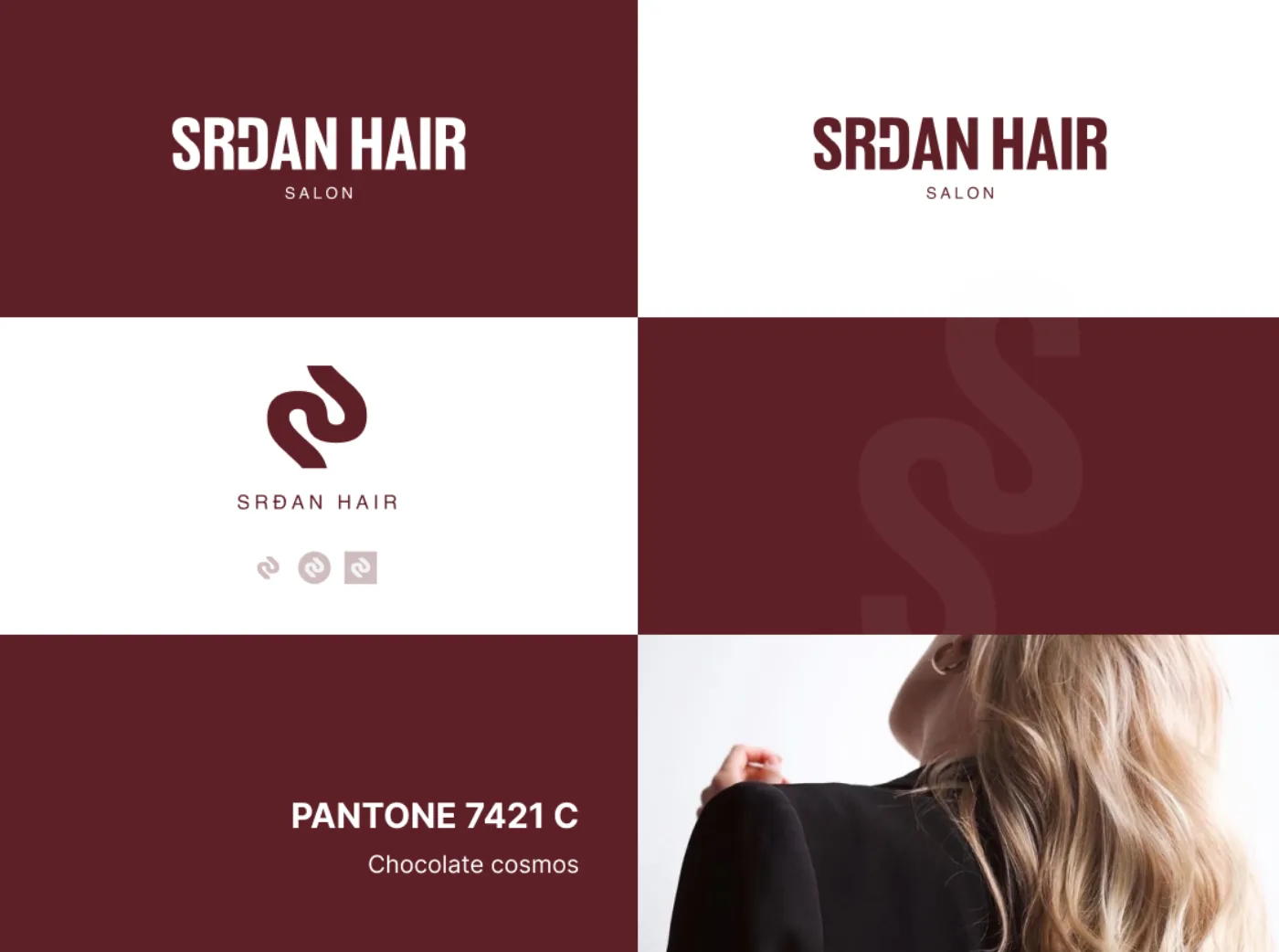
The logo development process explored over forty directions before converging on a wordmark-led solution. The final mark is composed in a custom-drawn typeface, close enough to familiar letterforms to feel grounded, but with enough refinement in the details to reward closer inspection. It works in black, in white, and embossed on packaging.
The color palette is anchored in warm off-whites and deep charcoals, with a single accent tone drawn from natural materials, close to sand, close to linen. It photographs beautifully and translates well across both physical and digital touchpoints. The full brand guidelines document ensures that anyone applying the identity, photographers, printers, web developers, has everything they need to keep it coherent.

03, Result
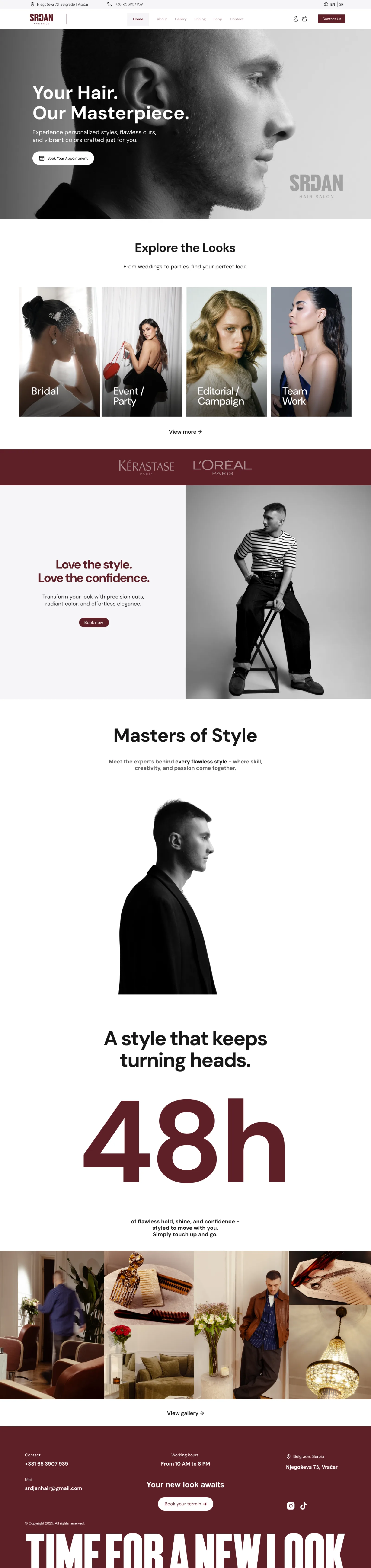
The new identity launched across all touchpoints simultaneously, physical collateral, social media, and the studio website. Client response was immediate: the brand now reads clearly as premium without relying on luxury clichés.
Most importantly, the identity gives Srđan Hair room to grow. The system is flexible enough to expand into new services, merchandise, and spaces while staying immediately recognizable. It's a brand built not just for today's studio, but for the next chapter.
Next Case Study
We use essential cookies to keep the site working, plus a few third-party services - Google Fonts, and reCAPTCHA on the contact form - that may set their own cookies. Privacy Policy.
