Case Study · 2023 – 2026
Type
Concept Work
Years
2023 – 2026
Services
Logo Design · Brand Identity
A logo is the most compressed form of communication a brand can make. In a single mark, it needs to carry the weight of a company's values, personality, and promise, and do it at any size, in any context, in any colour.
Deliverables
The Logos

A clinical, trustworthy mark for a diagnostics lab, paired with a calm teal palette that reads as care rather than sterility.

A confident, technical mark for an industrial automation leader, built to read as established rather than merely modern.

A bold monogram for a premium hair salon, designed to work equally well on signage and social.

Made for Unicorn, a German solar energy company - the green palette and geometric form are both drawn straight from the industry itself.
A precise, technical mark for an IT company, built to read as systematic rather than decorative.
A structured, authoritative mark for a defense-sector supplier of armament, equipment, and logistics across the Balkans.

A friendly, approachable mark for an IT studio building online shops and websites.

A playful mark for a Swiss second-hand furniture concept, built to feel approachable rather than corporate.

A precise, structural mark for a Swiss window and facade installer, built to signal Swiss-standard quality at a glance.
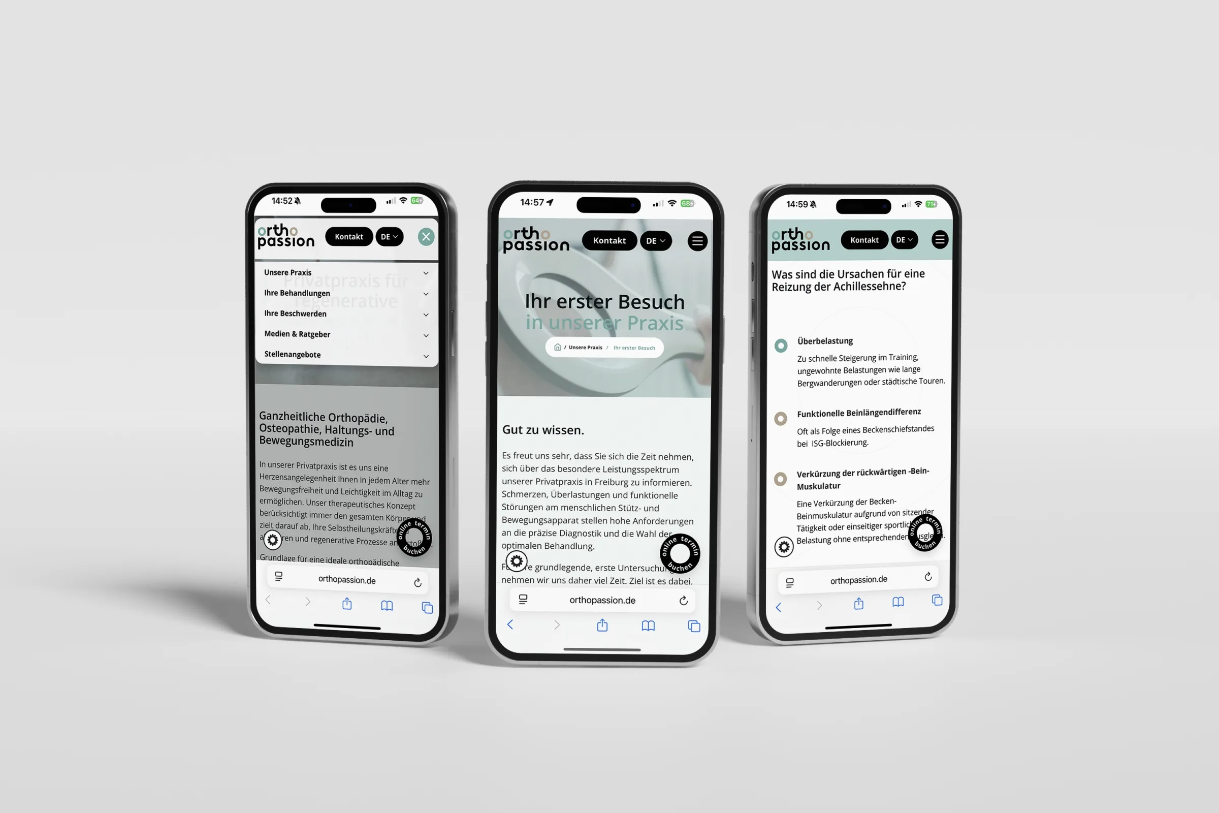
A warm, professional mark for a German consulting firm working in partnership with Orthopassion.

A grounded mark for a Swiss parquet flooring installer, built to feel dependable and precise.

A wordmark with a slight organic irregularity, built for a Swiss furniture and wood goods maker to feel as considered as the products themselves.
A confident wordmark for a fashion concept store in Montenegro.

A clean, functional mark for a commercial equipment supplier outfitting supermarkets, hospitality venues, and warehouses.

A studio exploration - a crisp Swiss cross mark built to test how far precision and restraint can carry a brand on their own.

Another studio exploration - a bridge motif built to explore how a mark can feel both structural and approachable at once.
01, Challenge
This collection represents a cross-section of logo work Studio Deadline has created across industries: hospitality, technology, legal services, energy, healthcare, fitness, and more. Each mark is the result of a process that starts with research and ends with a system, not just an icon, but a complete set of usage rules, colour applications, and typographic pairings.
02, Approach
We approach every logo brief with the same discipline: understand the competitive landscape, identify what makes this client distinct, and find the visual form that expresses that distinctiveness without relying on trend or cliché. A good logo should still work in ten years. That constraint forces clarity.
03, Result
The marks in this collection span wordmarks, monograms, pictorial symbols, and combination marks, chosen for the client's context, not for aesthetic preference. What they share is restraint: each one says exactly what it needs to say, and nothing more.
Next Case Study
We use essential cookies to keep the site working, plus a few third-party services - Google Fonts, and reCAPTCHA on the contact form - that may set their own cookies. Privacy Policy.
