Case Study · 2025
Client
Geefty
Year
2025
Services
Logo Design · Brand Identity
Industry
Retail · Corner Shop
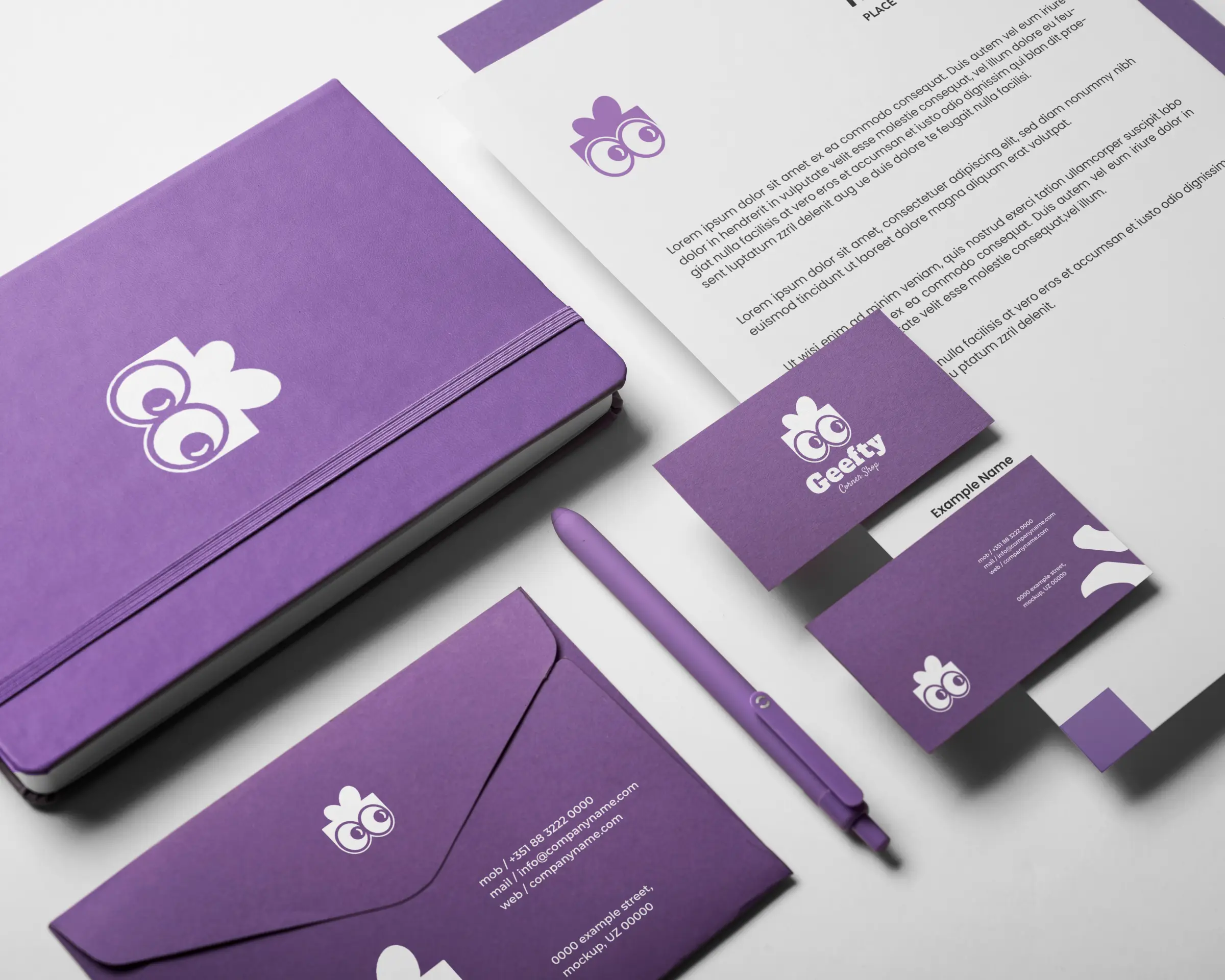
A playful, gift-box-and-eyes mark built to make a neighborhood corner shop memorable.
Deliverables
01, Challenge
Geefty is a corner shop competing for attention on a street full of near-identical storefronts. It needed a mark that a neighbourhood would actually remember and mention to a friend, not another generic shop sign that blends into the block.
02, Approach
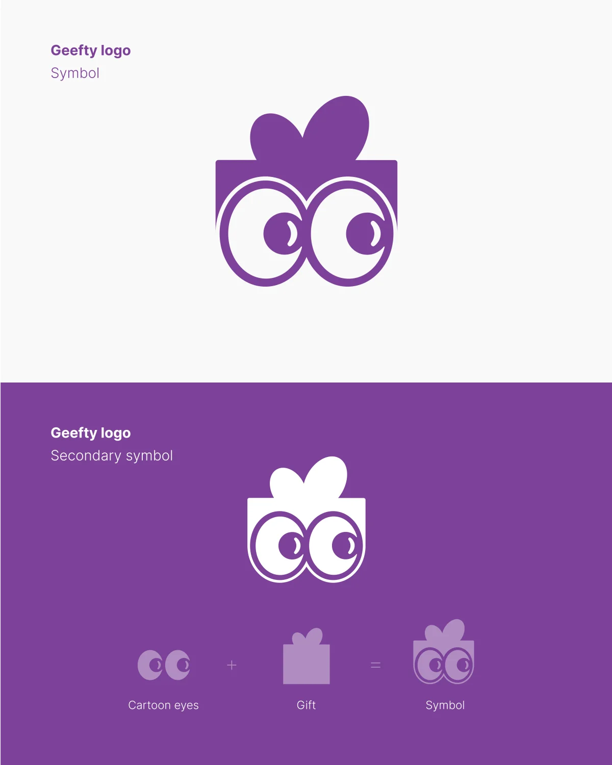
The mark combines a gift box with a pair of curious cartoon eyes, a simple pun on the name that reads instantly and works at any size, from a shop sign down to a favicon. A confident purple carries the identity across every application, giving a small, independent shop the kind of presence usually reserved for bigger brands.

03, Result
The identity now carries across stationery, packaging, and signage, giving Geefty a consistent, recognisable face wherever a customer encounters it.
Next Case Study
We use essential cookies to keep the site working, plus a few third-party services - Google Fonts, and reCAPTCHA on the contact form - that may set their own cookies. Privacy Policy.
