Case Study · 2021
Client
Kerbholz
Year
2021
Services
Logo Design
Industry
Furniture · Wood Goods
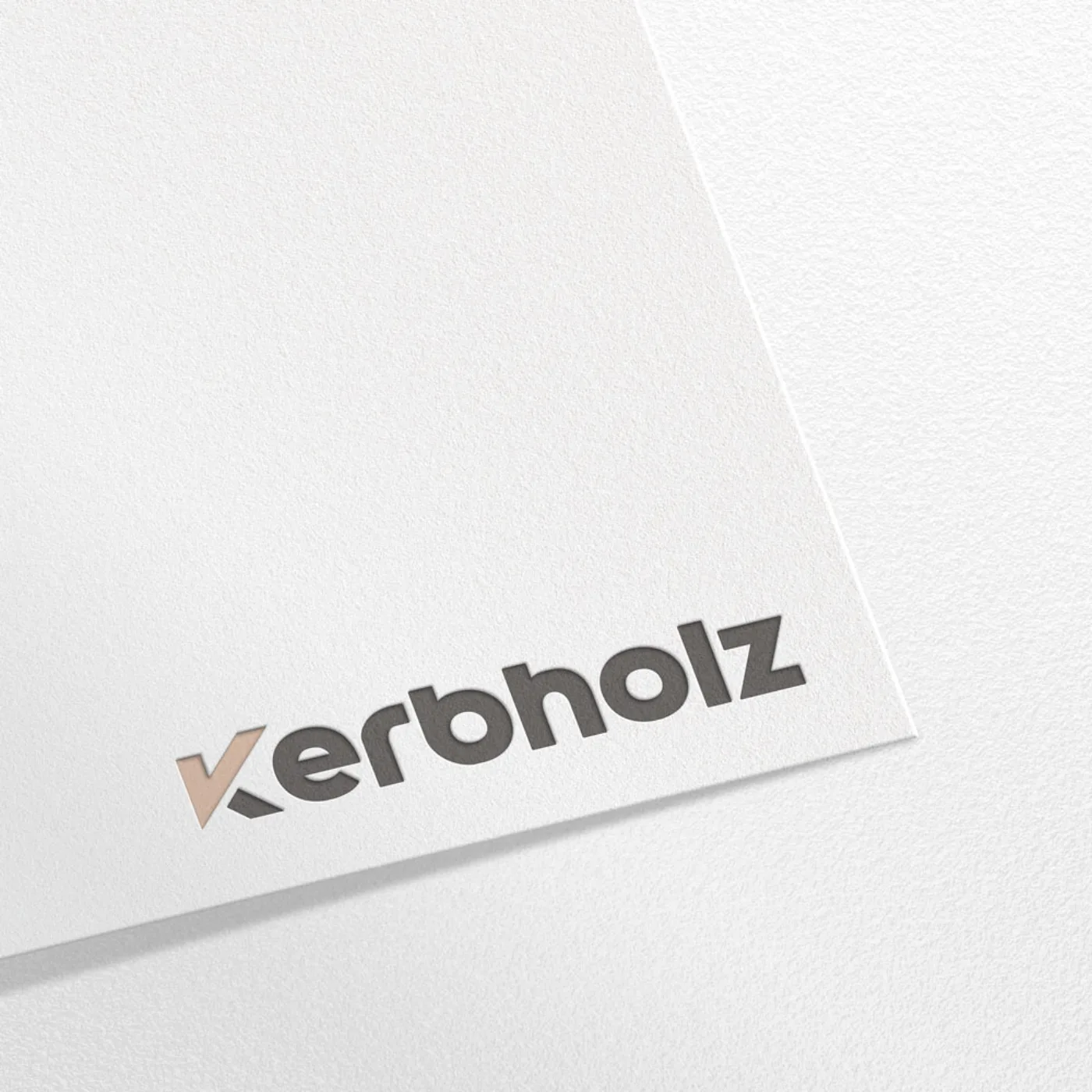
A wordmark carrying the same honest, material-forward character as the products it represents.
Deliverables
01, Challenge
Kerbholz creates premium furniture and wood goods from natural timber, with an honest, material-forward aesthetic. The brand needed a mark that carried the same honesty, something that felt considered and handmade in spirit without looking unfinished.
02, Approach
We designed a wordmark with a slight organic irregularity in its letterforms, paired with a muted, natural colour palette that echoes the wood, grain, and warmth of the Kerbholz product range. Every decision was tested against the same question: does this feel as considered as the objects it represents?
03, Result
The mark now anchors the brand across packaging, social presence, and point-of-sale materials, giving Kerbholz a consistent, considered identity that matches the quality of what they make.
Next Case Study
We use essential cookies to keep the site working, plus a few third-party services - Google Fonts, and reCAPTCHA on the contact form - that may set their own cookies. Privacy Policy.
