Case Study · 2025
Client
Mikrospin
Year
2025
Services
Brand Identity · Web Design · Development
Industry
Manufacturing
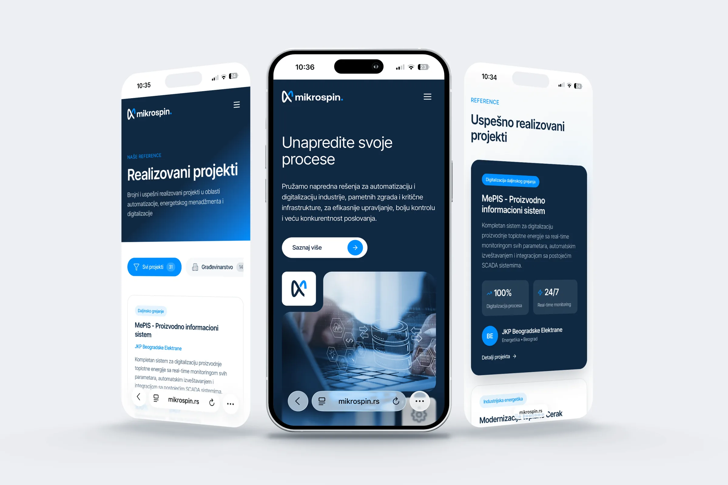
A cohesive digital identity built to reflect the brand's values and support long-term growth.
Deliverables
URL
mikrospin.rs
01, Challenge
The existing identity had served Mikrospin well through their early years, but it carried the visual language of a different era, heavy, rigid, and disconnected from the precision and quality the company actually delivers. Their website was a catalog, not a brand statement.
The challenge was not simply to modernize, it was to build an identity that communicated trust to enterprise clients while projecting forward momentum. Mikrospin competes against both established European manufacturers and agile new entrants. The brand needed to hold its own in both worlds.
02, Approach
We began with a thorough brand audit and a series of stakeholder interviews, understanding not just what Mikrospin does, but how they think about their work and what they want to be known for a decade from now.
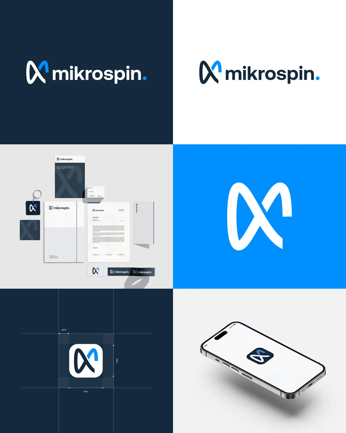
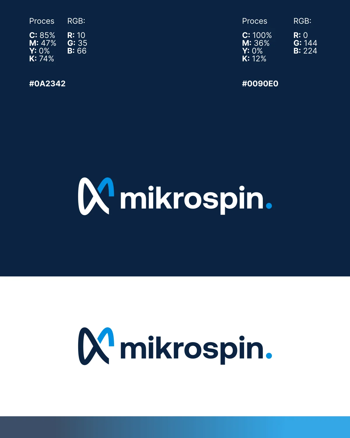
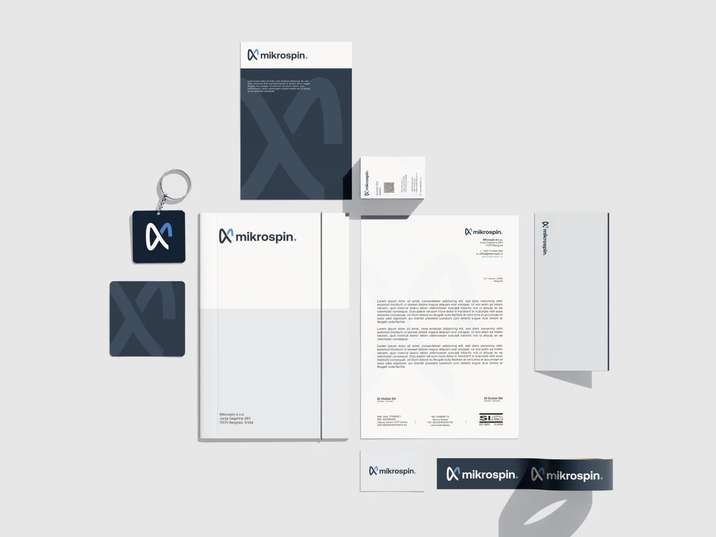
From research, we distilled three core brand attributes: precision, reliability, and momentum. These became the criteria against which every design decision was evaluated. The new logo is a reduction, clean geometry that references industrial precision without resorting to clichéd imagery.
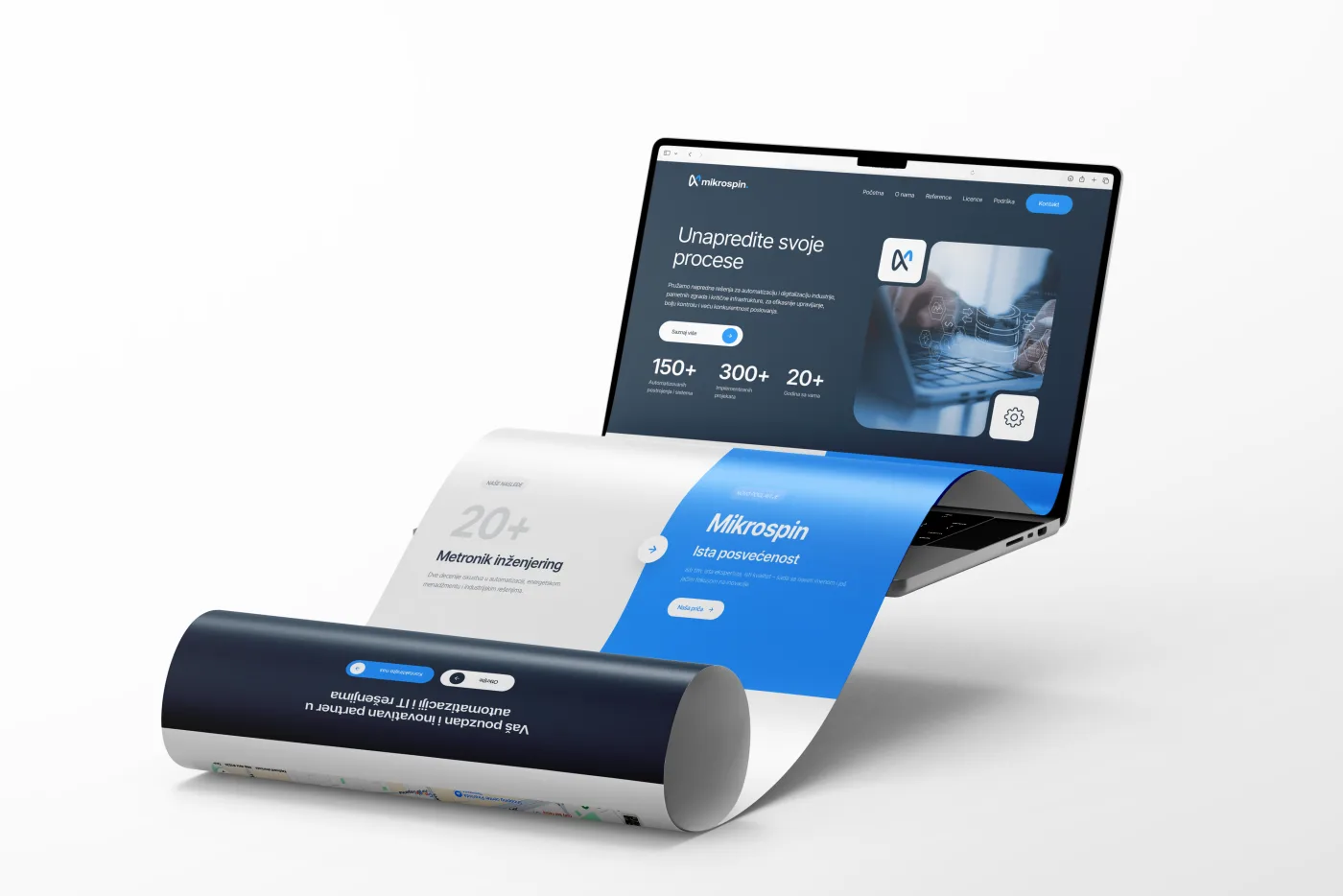
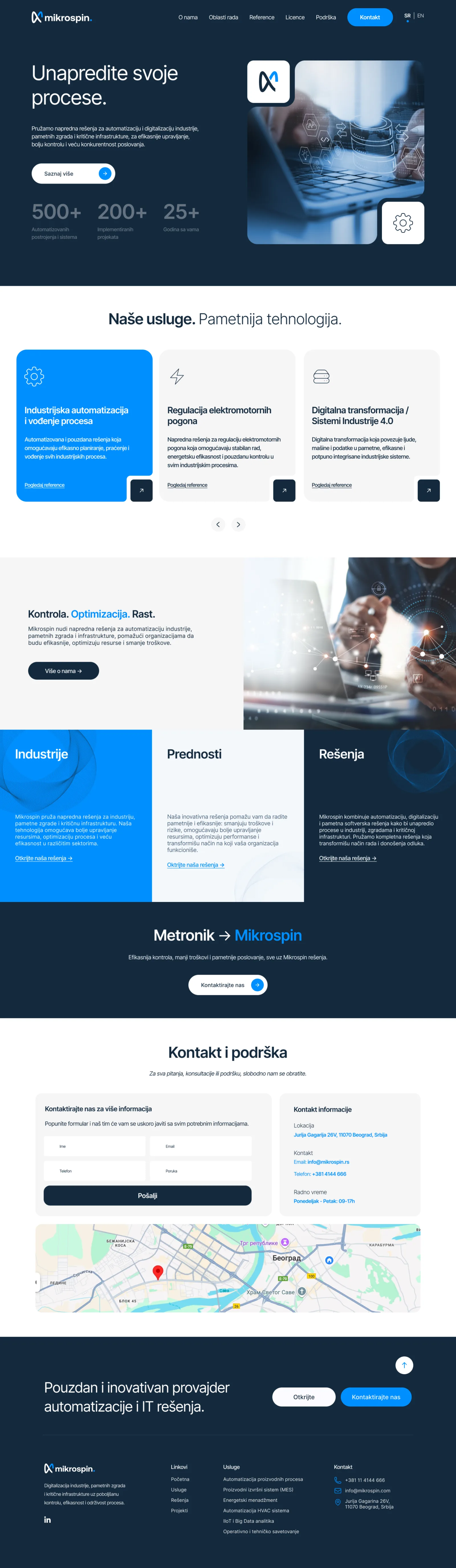
The color system pairs a deep navy with off-white and controlled use of a warm accent, professional, authoritative, and modern without being cold. Typography moves from mixed legacy typefaces to a single disciplined family, creating coherence across all touchpoints. The website was redesigned from the ground up: structured around client verticals, with every page engineered for clarity and conversion.
03, Result
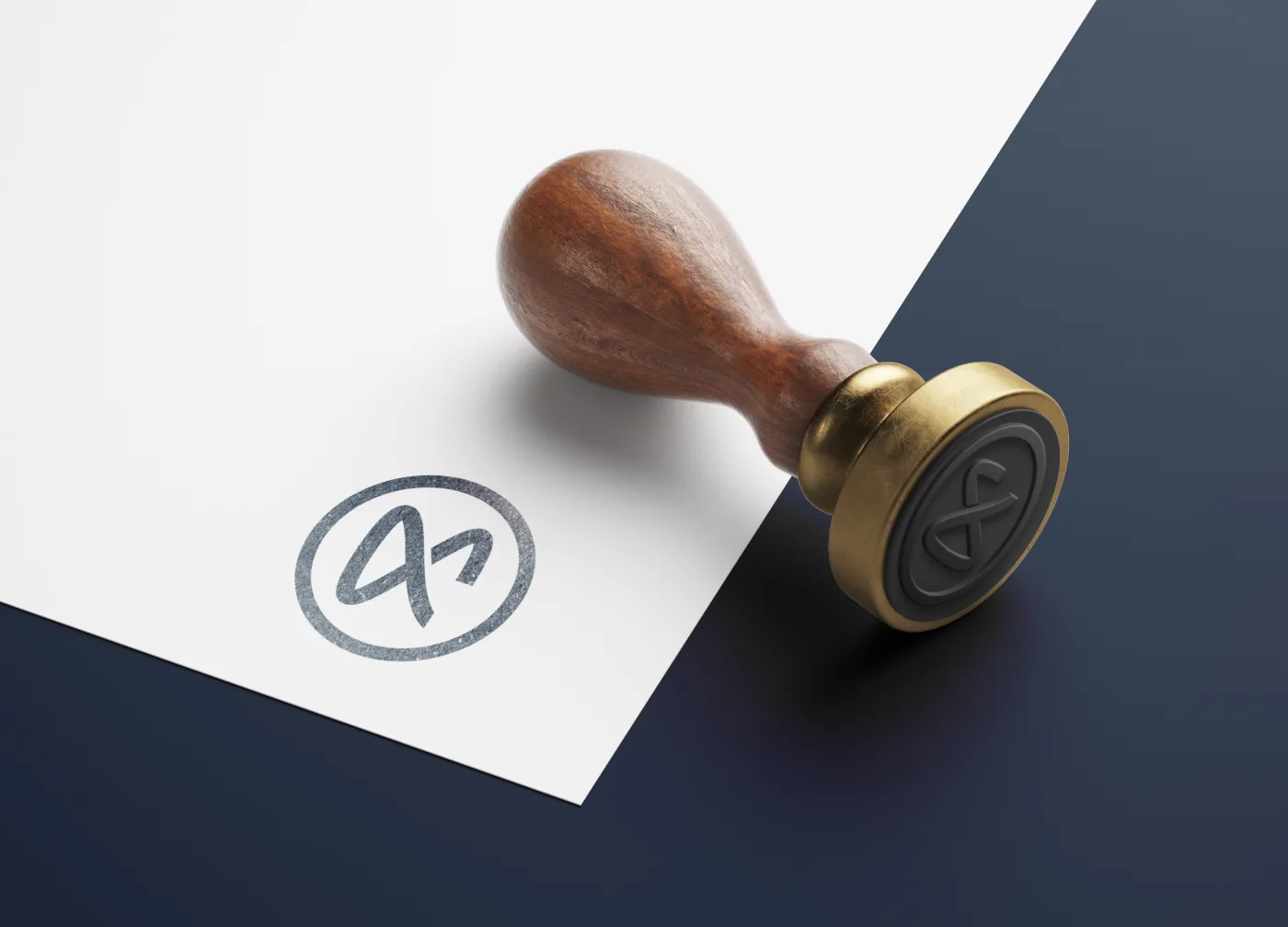
Mikrospin launched their new brand and website to immediate recognition from their existing clients and meaningful inbound interest from new prospects. The identity is built to scale, from business cards to exhibition stands, from digital ads to contract documents.
More than a visual refresh, the project gave Mikrospin's leadership a sharper language for who they are and where they're going. The brand now works as a strategic asset, not just a logo on a letterhead.
Read the full story in the Journal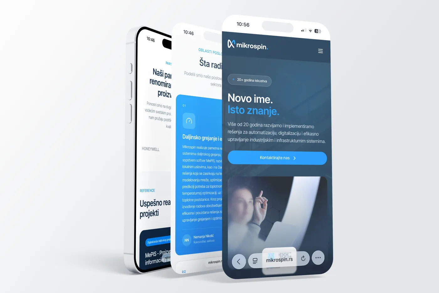
Next Case Study

We use essential cookies to keep the site working, plus a few third-party services - Google Fonts, and reCAPTCHA on the contact form - that may set their own cookies. Privacy Policy.
